
Are you using the power of color?
Color is one of the most valuable assets in your marketing toolkit. A signature color has the power to carry your brand image and differentiate your products in the market. By adding a color that matches your brand identity, you can raise awareness of your product and associate it with the values you stand for. You can also add value for customers by coordinating packaging with contents and making it easier for them to identify the product they want. Color is a unique and universal language with the power to invoke emotions and communicate information. Different colors can make people feel happy, safe, relaxed or energized. Green is associated with fresh and natural products, while red is perceived as dynamic, and pink as relaxing and inviting. As consumers intuitively choose products that fulfill their emotional needs, color is a very potent resource with the power to support your brand and boost your sales.
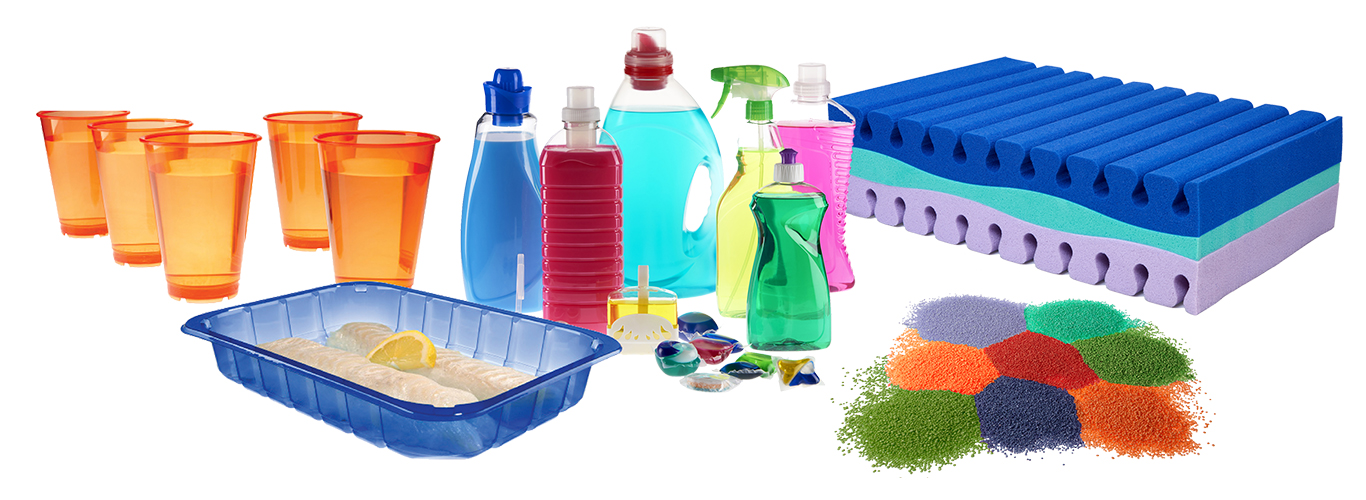
Seeing is believing
Research shows that, very soon after they first see a product, consumers subconsciously evaluate it, predominantly on its color. This makes color a vital asset when it comes to product differentiation. Color also has the power to communicate information about product qualities. For example, by coloring different foam layers in a mattress, you can highlight its structure and accentuate specific features.
The personalization trend
From sponges to footwear and houseware, there is a growing demand among consumers for items that are customized to meet individual needs and preferences. Adding a range of colors is a simple, effective way to stay ahead by providing unique products without having to change the fundamental design of your products.
Milliken’s ColorDirection 2020
To help you tap into the power of color, we have analyzed emerging trends and consumer preferences to establish our color projections for 2020. Milliken’s ‘ColorDirection 2020’ explores the colors of the human journey. The theme of Connected Comfort serves as a foundation for the six color tones selected for ColorDirection 2020 — reflecting the convenience, flexibility and personal experiences capturing the connection color creates between products from various markets and the consumers they serve.
Exception occured while executing the controller. Check error logs for details.Discover our Reactint Colorants for PU Foam
Exception occured while executing the controller. Check error logs for details.Did you know that we also provide eco-friendly colorants for fertilizers? Find out more.
Would you like the Pantone references for our ColorDirection 2020? Contact us.